Choosing between dark and light curtains is not simply a matter of personal preference. The right curtain colour depends on the size of the room, the amount of natural light it receives, the existing walls and furniture, and the atmosphere you want to create.
Light curtains generally make a room feel brighter, larger and more open. Dark curtains can add depth, warmth, contrast and a cosier feel. Neither option is universally better. The best curtain colour is the one that works with the room as a whole.
A colour that looks perfect in a showroom or on a small fabric swatch can appear completely different when it is hung across a full window. Natural light, artificial lighting, fabric texture and curtain folds can all change the way a shade looks.
Before choosing between dark and light curtains, consider how the fabric will interact with the complete space rather than selecting the colour separately.

Dark vs Light Curtains: Quick Comparison
This table provides a useful starting point, but curtain colour should always be assessed alongside the room’s natural light, furnishings and overall design.
1. Light Curtains: Benefits and Considerations
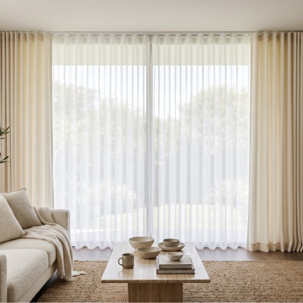
Light-coloured curtains include white, ivory, cream, beige, greige, soft grey and muted pastel shades. They are often chosen for their ability to make interiors feel calm, spacious and welcoming.
Because lighter shades reflect more light, they can visually open up a compact room. They also reduce the visual weight around the window, particularly when the fabric colour is similar to the wall colour.

Light curtains are especially suitable for:
-
Smaller living rooms and bedrooms
-
Rooms that receive limited natural light
-
Homes with low ceilings
-
Spaces with dark flooring or heavy furniture
-
Minimal, contemporary or Scandinavian interiors
However, pale curtains do not have to look plain. Texture, pleat style and fullness can add depth to even the most neutral fabric. A well-constructed ivory curtain with generous fullness may look more luxurious than a deeper fabric that lacks structure.

The undertone is equally important. Warm whites, creams and beiges usually complement natural wood, brass details, warm flooring and earthy interiors. Cooler whites and soft greys work well with crisp walls, black metal, chrome and blue-grey colour palettes.
Very light fabrics may show dust, stains and everyday marks more easily, particularly near balconies, busy roads, children or pets. Fabric maintenance should therefore be considered alongside appearance.
2. Dark Curtains: Benefits and Considerations
Dark-coloured curtains include navy, charcoal, forest green, chocolate brown, burgundy, plum and black. These deeper tones create stronger contrast and can make a room feel more grounded and intimate.

Dark curtains work particularly well in:
-
Large living rooms
-
Spacious bedrooms
-
Rooms with high ceilings
-
Wide or tall windows
-
Interiors with pale walls
-
Spaces where curtains are intended to become a focal point
In bedrooms, richer curtain shades can create a warm, cocoon-like atmosphere. In larger living rooms, they can frame the windows and prevent the space from feeling visually empty.
However, dark curtains need to be balanced with the rest of the room. When deep curtains are combined with dark flooring, heavy furniture and limited daylight, the room may feel smaller or closed in.

It is also important to remember that a dark fabric does not automatically provide blackout. A loosely woven dark material may still allow light to pass through, while a light-coloured curtain with blackout lining may block significantly more sunlight.
Deep colours can also fade when exposed to intense direct sunlight. A suitable lining can help protect the face fabric, improve the curtain’s fall and increase its lifespan.
For rooms where very dark curtains may feel too heavy, consider a medium-depth shade or combine deeper main curtains with pale sheers.
3. Consider the Room Size and Natural Light
Room size and natural light should be assessed together.
In a small room, light curtains are often the more reliable choice because they create less visual weight. Choosing a curtain shade close to the wall colour can make the space feel wider and more continuous.
Hanging curtains close to the ceiling and extending them to the floor can also create the illusion of height. This effect depends not only on colour but also on correct measurements and installation.
Dark curtains can work in smaller rooms when there is enough daylight or when the surrounding palette is kept light. Similarly, a large room does not always require dark curtains. Pale curtains may be better if the room already contains bold furniture, patterned walls or heavy architectural details.
Natural light also changes curtain colour throughout the day. Morning sunlight can make beige, cream and earthy shades appear warmer. Low-light rooms may bring out grey or blue undertones. Strong afternoon sunlight can make colours look more intense.
A fabric should therefore be viewed during the morning, afternoon and evening, as well as under artificial lighting.
Small swatches do not always show these changes accurately. When a full curtain is pleated and hung, some sections catch the light while others remain in shadow. This creates natural tonal variation that cannot be judged from a flat sample.

4. Match Curtains With Walls, Furniture and Flooring
Curtains should never be chosen in isolation.
Begin with the walls. Curtains in a similar tone create a soft, seamless appearance, while contrasting shades make the windows more prominent.
For example, beige curtains against warm neutral walls can create a calm and layered interior. Navy or forest-green curtains against pale walls can create stronger definition.
Next, consider the furniture. If the sofa, bed or chairs are already colourful or heavily patterned, the curtains may need to remain quieter. If the furniture is neutral, richer curtain shades can introduce depth and personality.
Flooring also occupies a large visual area and can affect how the chosen fabric colour appears. Dark floors combined with dark furniture and deep curtains may make the room feel heavy unless there is enough light or contrast elsewhere.
You do not need to match every element exactly. Exact colour matching can sometimes make an interior appear flat. Coordinating undertones usually creates a more balanced result.
Warm beige curtains may complement caramel-toned wood, cream upholstery and brass accents. Cooler grey curtains may pair better with white walls, blue-toned furniture, black metal or cooler flooring.
5. Best Curtain Colours for Different Rooms
Different rooms have different functional and visual requirements.
Living Room
The living room is often the most visible and frequently used space in the home. Light neutrals can make it feel open and versatile, while richer shades add sophistication and frame large windows.
The best curtain colour for a living room should support the main furniture, flooring and wall palette rather than compete with them.

Bedroom
In bedrooms, both mood and light control matter. Navy, charcoal, olive and warm brown can create a restful, cosy atmosphere. Ivory, beige and soft grey can make a smaller bedroom feel calmer and more spacious.
Blackout lining can be added to both light and dark curtains, so the colour does not need to be selected solely for light blocking.

Dining Room
Deeper tones can add warmth and formality to a dining room, especially when used with wood, metal or layered lighting. Lighter shades help maintain brightness in dining areas used frequently during the day.

Children’s Room
Soft and versatile shades generally adapt better as the child’s furniture, interests and décor change. Practicality, maintenance and light control should also influence the choice.

Home Office
Light or medium shades can help maintain brightness without making the room feel distracting. The fabric’s ability to filter glare may be more important than whether the colour is dark or light.

6. How Fabric, Lining and Pleats Affect Colour
The same colour can look noticeably different across different fabrics.
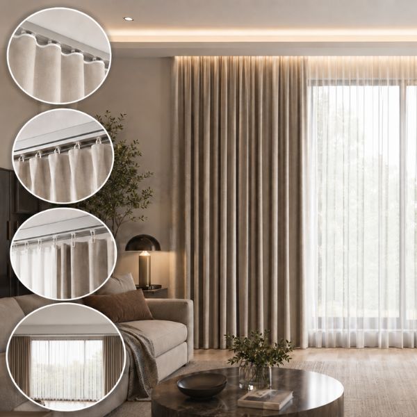
Velvet absorbs light and makes colours appear deeper and richer. Linen and linen-look fabrics have visible texture and natural tonal variation. Smooth materials tend to appear more uniform, while textured fabrics create highlights and shadows across the surface.
Pleat style and curtain fullness also change how a shade appears. Generous fullness creates deeper folds, more movement and greater tonal variation. Insufficient fullness can make even an expensive fabric look flat.
The lining also influences performance and appearance. A suitable lining can:
-
Improve the curtain’s fall
-
Provide better privacy
-
Increase light control
-
Protect the face fabric
-
Give pale fabrics a more substantial appearance
-
Help deep colours retain their richness for longer
Layering light sheers with darker main curtains offers flexibility. The sheers soften daylight during the day, while the main curtains provide privacy and stronger visual impact when closed.
Colour, texture, lining, fullness, pleat style and installation should therefore be treated as one complete curtain decision.
Internal Link Opportunities: Read more about popular curtain pleat styles and how blackout lining works.
7. Common Curtain Colour Mistakes
One of the most common mistakes is selecting a curtain colour from a small swatch without seeing how it looks when hung.
Another mistake is choosing a shade only because it is currently popular. Trends can provide inspiration, but curtains are a long-term investment. The colour should work with the room and the furniture you plan to retain.
It is also a mistake to assume that dark curtains automatically provide better light control or that pale curtains cannot offer privacy. Fabric weave, thickness and lining have a much greater impact on performance.
Homeowners may also overlook the difference between showroom lighting and the lighting inside their homes. Artificial retail lighting can alter undertones and make colours appear warmer or cooler than they actually are.
Finally, avoid selecting the curtain colour separately from the wall, flooring and furniture. A beautiful shade can still feel wrong if it does not belong within the wider interior palette.
8. Dark vs Light Curtains: Making the Final Decision
Choose light curtains when you want the room to feel brighter, larger, softer or more relaxed. They are particularly effective in compact rooms, low-light spaces and interiors that already contain darker furniture or flooring.
Choose dark curtains when you want to add depth, warmth, contrast or a richer, cosier atmosphere. They are especially suitable for larger rooms, bedrooms and spaces with pale walls or strong natural light.
There is no universally correct curtain colour. The right choice depends on the room’s dimensions, lighting, walls, flooring, furniture, fabric texture and intended mood.
The most reliable way to decide is to see the fabric at full length inside your home.
D’Moksha brings 25–30 full-length curtain samples to your space, allowing you to compare lighter shades and deeper tones in the room’s actual lighting. You can observe how each fabric changes throughout the day, how it complements the furniture and how the colour looks once the fabric is properly hung.
The right curtain colour should not only look beautiful in a catalogue or showroom. It should bring the entire room together.